Cancer Analysis and Creating Model on Haberman’s Dataset: Beginner’s Level


About the data:
Today we will be doing Exploratory data analysis on Haberman’s Cancer survival data, which was surveyed in the period 1958–1970.
Attribute Information (columns in dataset):
Age of patient at time of operation (numerical)
Patient’s year of operation (year — 1900, numerical), only last 2 digits of the year is mentioned
Number of positive axillary nodes detected (numerical), number of cancer axillary nodes detected during the time of operation.
Survival status (class attribute) 1 = the patient survived 5 years or longer 2 = the patient died within 5 year
Setting up the environment (Import libraries and Data):
 Importing libraries
Importing the required libraries for analysis and their purpose are:
Pandas is used for handling the dataset.
Numpy is used for imposing mathematical calculations on the dataset.
Matplotlib and seaborn is used for visualization.
 Importing dataset
Importing the data from .csv file using pandas library function read_csv().
2. Preparing the data and overview
 Year Format convention
Since the given year format is in ‘YY’, we could change it into ‘YYYY’.
 Numeric Description on Dataset
Getting a descriptive idea on the data:
Dataset shape denotes we have 306 rows of data and 4 columns.
Column name in the dataset is ‘Age’, ‘OperationYr’, ‘Nodes’, ‘Survival’ .
None of our columns contain Null values.
Survey was done for the period 1958 to 1969.
 Survival and Not Survived Counts
We have got data of 225 people who survived and 81 people who died after operation.
3. EDA — Exploratory Data Analysis
3.1 To Find if there any relationship between age, Operation Year, Nodes with Survival Rate:
 1.1
1.1
This Graph depicts the probability distribution function (PDF) for Survived and Not survived patients with respective to their Operation Year (plot 1.1).
 1.2
1.2
 1.3
1.3
Similarly this graph depicts the PDF, with respective to Age of the patients (plot 1.2).
This plot depicts the Nodes of the patients (plot 1.3).
Compare to 3 plots above, Nodes Plot (1.3 plot ) showed difference in Survival and Not survived PDF. So its clear that Nodes influenced the Survival rate.
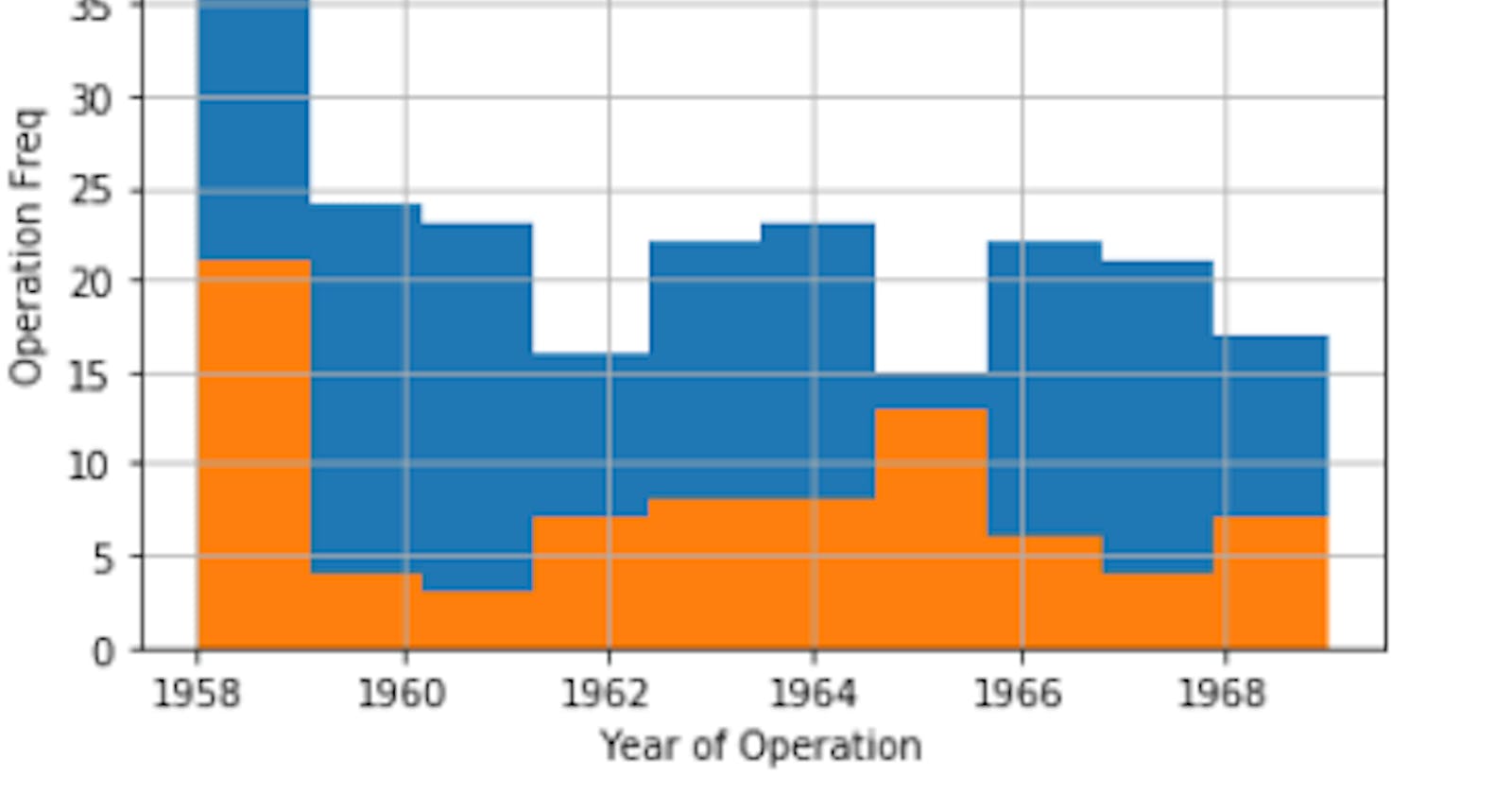
3.2 To Find how No. of operations & survival rate changed over the year:
 2.1
2.1
We could notice Survived people did more operation than not survived, Almost Double the times. (plot 2.1)
3.3 To find If there is any relation between the columns/ attributes:
 Used Seaborn to plot all the attributes with each other.
 3.1
3.1
In Age vs Nodes plot, class variables can be differentiated from each other. In our further analysis we could consider Age and Nodes attributes mainly, as some pattern can be found. However, all other attributes didn’t show much difference in their PDF. Moving forward we can use Age and Node to further analyze the dataset and know if they influence the survival rate.
3.4 Finding the relation between Nodes vs Age:
 4.1
4.1
As more green dots are in lower region of the graph. We could get a insight that lesser the Nodes, More the survival rate.
3.5 To Find Average nodes between Survived and Not survived people:
 5.1
5.1
We could get an insight that on average not survived people have threefold times more nodes than survived. (plot 5.1)
3.6 Bi-variate analysis with Nodes attribute:
 6.1
6.1
We could see that major portion of the nodes for survival people is within 5 nodes. More than 5 nodes survival becomes tough. (plot 6.1)
3.7 Grouping by the dataset respective to age:
 7.1
7.1
Grouping the dataset into groups of age, we did this because from the above insights we could sense that there is some correlation between age and nodes. (plot 7.1)
Note: How we did the above grouping can be found in the github repository, link in the end of the article.
3.8 To find what ages groups people have more Nodes and their survival:
 8.1
8.1
From the above two plots, we get insight that nodes might have influence in not survival rate, Not survived people have more nodes, especially age between 40–70. (plot 8.1)
3.9 Further analysis on the dataset using Nodes and Age:
 Bar plot of Age vs Nodes (8.2)
 scatter plot of Age vs Nodes (8.2)
large amount of not survived points can be found in middle and slightly upper region of the plot. (plot 8.2)
4. Insights:
From the above plots we get following insights we can group of datasets into:
 Insight 1.1
 Insight 1.2
Large amount of people who survived (around 67%) the cancer operation had nodes less than 3 and age was between 44 to 58 (plot insight 1.2)
5. Creating a Model:
Since this is a beginner level we would be using if- conditions to create a model, in future will be using actual algorithms.
 Model 1.1
Using the above model we can predict the survival rate of the patients after the operation done. (plot Model 1.1)
Test results:
 Model 1.2
We could see that our model could predict the survival rate with Age and Nodes as the input parameter. (plot Model1.2)
Kindly find the code at GitHub repository: Kailash7dev/Cancer-Analysis-on-Haberman-s-Datasets Haberman's Cancer Analysis. Contribute to Kailash7dev/Cancer-Analysis-on-Haberman-s-Datasets development by creating an…github.com
— Kailash Sukumaran